
End-To-End Breast Cancer Model Explainability using SHAP and Random Forest Algorithm.
Explainable artificial intelligence| Breast Cancer Model Explainability |DPhi submission December 2021 | Maximilien Kpizingui


Table of contents


No headings in the article.
Model explainability and interpretability are one of the major concerns in the field of machine learning and artificial intelligence nowadays. We are gradually moving from traditional machine learning 'Black Box' where we preprocess data and feed into our training algorithm by relying only on accuracy score and classification report to explain how good our model performs on training and validation dataset d to 'White Box' a near explainable and interpretable model. In the following, we are going to use SHAP (SHapley Additive exPlanations) to explain breast cancer model using random forest classifier.
Contents
1- What is SHAP
2- Goal of SHAP
3- SHAP value
4- SHAP Explainer
5- List of SHAP charts
6- Model-Agnostic Method and advantages
7- Model-Agnostic Method layers
8- Implementation of breast cancer model explainability using SHAP and random forest classifier algorithm
1- What is SHAP
SHAP (SHapley Additive exPlanations) is a unified approach to explain the output of any machine learning model. It has optimized functions for interpreting tree-based models and a model agnostic explainer function for interpreting any black-box models for which the predictions are known.
2- Goal of SHAP
The goal of SHAP is to explain the prediction of an instance x by computing the contribution of each feature to the prediction. The SHAP explanation method computes Shapley values from coalitional game theory. The feature values of a data instance act as players in a coalition. Shapley values tell us how to fairly distribute the the prediction among the features.
3- SHAP value
Shapley values are a widely used approach from cooperative game theory. The essence of Shapley value is to measure the contributions to the final outcome from each player separately among the coalition while preserving the sum of contributions being equal to the final outcome. Though there are some other techniques used to explain models like permutation importance and partial dependence plots, below are some benefits of using SHAP values over other techniques:
Global interpretability : SHAP values not only show feature importance but also show whether the feature has a positive or negative impact on predictions. Local interpretability : We can calculate SHAP values for each individual prediction and know how the features contribute to that single prediction. Other techniques only show aggregated results over the whole dataset. SHAP values can be used to explain a large variety of models including linear models (e.g. linear regression), tree-based models (e.g. XGBoost) and neural networks, while other techniques can only be used to explain limited model types.
4- SHAP Explainer
SHAP has a list of classes which can help us understand a different kind of machine learning models from many python libraries. These classes are commonly referred to as explainers. This explainer generally takes the ML model and data as input and returns an explainer object which has SHAP values which will be used to plot various charts explained later on. Below is a list of available explainers with SHAP.
- AdditiveExplainer: This explainer is used to explain Generalized Additive Models.
- This explainer uses the brute force approach to find shap values which will try all possible parameter sequence.
- DeepExplainer: This explainer is designed for deep learning models created using Keras, TensorFlow, and PyTorch. It’s an enhanced version of the algorithm where we measure conditional expectations of SHAP values based on a number of background samples. It's advisable to keep reasonable samples as background because too many samples will give more accurate results but will take a lot of time to compute SHAP values. Generally, 100 random samples are a good choice.
- GradientExplainer: This explainer is used for differentiable models which are based on the concept of expected gradients which itself is an extension of the integrated gradients method.
- KernelExplainer: This explainer uses special weighted linear regression to compute the importance of each feature and the same values are used as SHAP values.
- LinearExplainer: This explainer is used for linear models available from sklearn. It can account for the relationship between features as well.
- PartitionExplainer: This explainer calculates shap values recursively through trying a hierarchy of feature combinations. It can capture the relationship between a group of related features.
- PermutationExplainer: This explainer iterates through all permutation of features in both forward and reverses directions. This explainer can take more time if tried with many samples.
- SamplingExplainer: This explainer generates shap values based on assumption that features are independent and is an extension of an algorithm proposed in the paper "An Efficient Explanation of Individual Classifications using Game Theory".
- TreeExplainer: This explainer is used for models that are based on a tree-like decision tree, random forest, gradient boosting.
- CoefficentExplainer: This explainer returns model coefficients as shap values. It does not do any actual shap values calculation.
- LimeTabularExplainer: This explainer simply wrap around LimeTabularExplainer from lime library. If you are interested in learning about lime then please feel free to check on our tutorial on the same from references section.
- MapleExplainer: This explainer simply wraps MAPLE into shap interface.
- RandomExplainer: This explainer simply returns random feature shap values.
- TreeGainExplainer : This explainer returns global gain/Gini feature importances for tree models as shap values.
- TreeMapleExplainer : This explainer provides a wrapper around tree MAPLE into shap interface.
5- List of SHAP charts
- summary_plot creates a beeswarm plot of shap values distribution of each feature of the dataset.
- decision_plot shows the path of how the model reached a particular decision based on shap values of individual features. The individual plotted line represents one sample of data and how it reached a particular prediction.
- multioutput_decision_plot shows decision plot for multi output models.
- dependence_plot shows relationship between feature value (X-axis) and its shape values (Y-axis).
- force_plot plots shap values using additive force layout. It can help us see which features most positively or negatively contributed to prediction.
- image_plot plots shape values for images.
- monitoring_plot helps in monitoring the behavior of the model over time. It monitors the loss of model overtime.
- embedding_plot projects shap values using PCA for 2D visualization. partial_dependence_plot shows basic partial dependence plot for a feature.
- bar_plot shows a bar plot of shap values impact on the prediction of a particular sample.
- waterfall_plot shows a waterfall plot explaining a particular prediction of the model based on shap values. It kind of shows the path of how shap values were added to the base value to come to a particular prediction.
- text_plot plots an explanation of text samples coloring text based on their shap values.
6- Model-Agnostic Method and advantages
The process of separating the explanations from the machine learning model is called model-agnostic interpretation methods. The advantages of applying model-agnostic explanation system are :
Model flexibility: The interpretation method can work with any machine learning model, such as random forests, linear model and deep neural networks.
Explanation flexibility: You are not limited to a certain form of explanation. In some cases it might be useful to have a linear formula, in other cases a graphic with feature importance.
Representation flexibility: The explanation system should be able to use a different feature representation as the model being explained.
7- Model-Agnostic Method layers
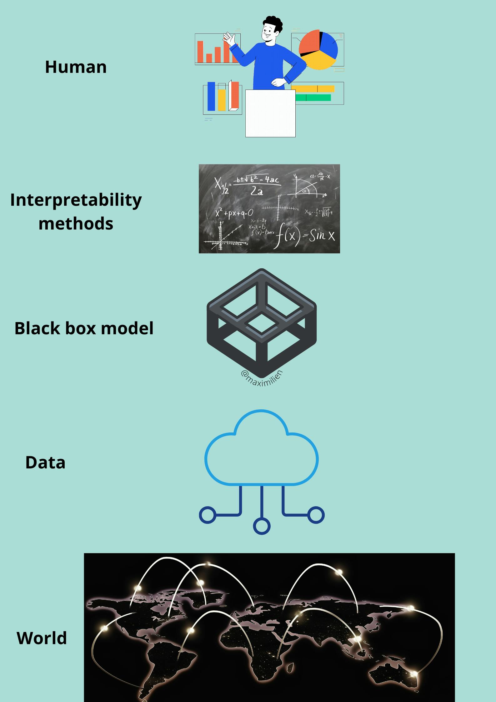
Let us have a look at model-agnostic interpretability. We capture the world by collecting data and abstract it further by learning to predict the data with a machine learning model.
The World layer: It contains everything that can be observed which we aim to learn something about and interact with.
Data layer: We have to digitize the World in order to make it processable for computers and also to store information. The Data layer contains anything from images, texts etc.
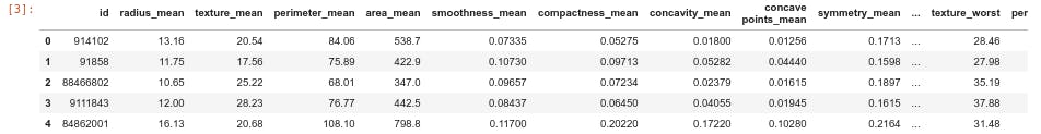
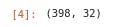
Black box model layer: We fit the preprocessed data into the machine learning model and predict the outcome on unseen test data. Interpretability Methods layer: It deals with the opacity of machine learning models. What were the most important features for a particular diagnosis? Why was a financial transaction classified as fraud?
The last layer is occupied by a Human where all the explaination takes place.
8- Implementation of breast cancer model explainability using SHAP and random forest classifier algorithm
Problem statement: Breast cancer is a type of cancer that starts in the breast. Cancer starts when cells begin to grow out of control.A benign tumor is a tumor that does not invade its surrounding tissue or spread around the body. A malignant tumor is a tumor that may invade its surrounding tissue or spread around the body. We are required to use SHAP to explain the prediction of our model either a cancer is malignant or benign using random forest.
The dataset used below can be downloaded from DPhi github reposetory here
- Importing Necessary Libraries
from sklearn.ensemble import RandomForestClassifier
from sklearn.model_selection import train_test_split
from matplotlib.colors import ListedColormap
import matplotlib.pyplot as plt
import seaborn as sns
import pandas as pd
import numpy as np
import warnings
warnings.filterwarnings('ignore')
import shap
shap.initjs()
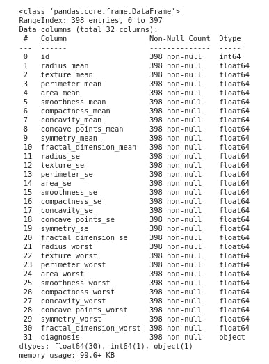
- Loading the first five row of the data
df=pd.read_csv("https://raw.githubusercontent.com/dphi-official/Datasets/master/breast_cancer/Training_set_breastcancer.csv")
df.head()
- Perform Basic Exploratory Data Analysis
This section displays the summary statistic that quantitatively describes or summarizes features of a collection of information, the process of condensing key characteristics of the data set into simple numeric metrics. Some of the common metrics used are mean, standard deviation, and correlation.
- Checking the dimensionality of the dataframe
df.shape
- Getting a concise summary of the dataframe
df.info()
- Descriptive statistics
df.describe().transpose()
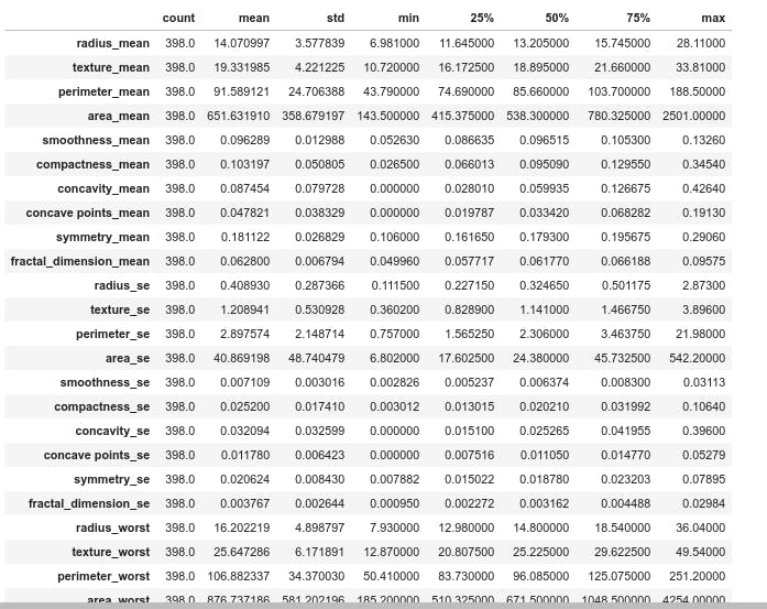
From the difference between the median and mean in the figure it appears some features have skewness.
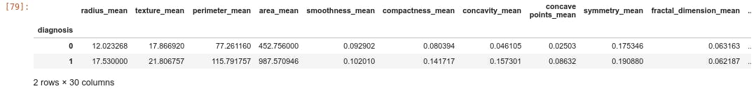
Based on the diagnosis class, data can be categorized using the mean value as follows.
df.groupby('diagnosis').mean()
- Grouping the label in classes and displaying the number of element per class
print(df.groupby("diagnosis").size())

-Displaying the distribution of elements per class
sns.countplot(df['diagnosis'], label="Count", palette=sns.color_palette(['blue', 'red']),
              order=pd.value_counts(df['diagnosis']).iloc[:398].index)
plt.show()
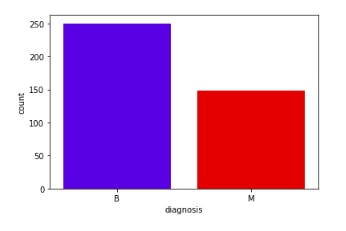
From the above figure of count plot graph, it clearly displays there is more number of benign (B) stage of cancer tumors in the data set which can be cured.
- Dropping the id column cause it does not affect our analysis
df = df.drop('id', axis=1)
- Plotting correlation among among and target variable
df_corr = df.corr()
plt.figure(figsize=(20, 12))
sns.heatmap(df_corr, cbar=True, annot=True, yticklabels=df.columns,
            xticklabels=df.columns)
plt.show()
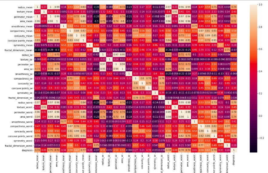
Each square shows the correlation between the variables on each axis. Correlation ranges from -1 to +1. Values closer to zero means there is no linear trend between the two features. The close to 1 the correlation is the more positively correlated they are; that is as one increases so does the other and the closer to 1 the stronger this relationship is. A correlation closer to -1 is similar, but instead of both increasing one variable will decrease as the other increases. The diagonals are all 1 because those squares are correlating each variable to itself so it's a perfect correlation. For the rest, the larger the number and lighter the color, the higher the correlation between the two variables. The plot is also symmetrical about the diagonal since the same two variables are being paired together in those squares.
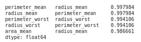
- Printing features with high correlation
high_correlation =df_corr.abs()
high_correlation_unstack=high_correlation.unstack()
high_correlation_sort = high_correlation_unstack.sort_values(ascending=False)
print(high_correlation_sort[30:35])
- Plotting distribution of features with highest correlation "radius_mean and perimeter_mean"
sns.jointplot("radius_mean", "perimeter_mean", data=df, kind="scatter",space=0, color="blue", height=9, ratio=3)
plt.show()

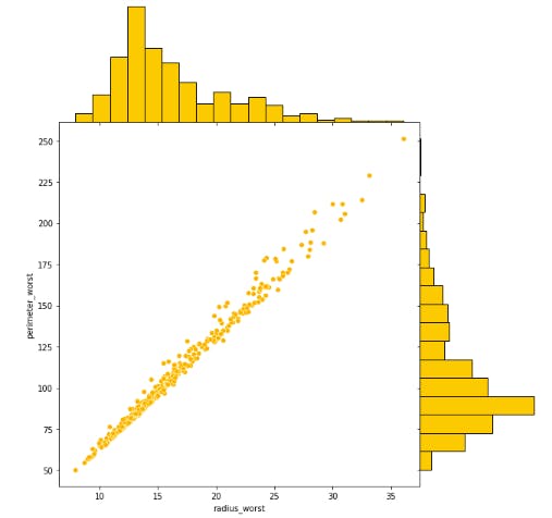
- Plotting distribution of features with highest correlation "radius_worst and perimeter_worst"
- Splitting the data into Train and Test sets
X=df.drop("diagnosis",axis=1)
y=df.diagnosis.map({'B':0, 'M':1}).astype(np.int)
- The train to test ratio should be 80:20 and the random_state should be 0
X_train, X_test,y_train,y_test=train_test_split(X,y,test_size=20,random_state=0)
- Use Random Forest Machine Learning Model for prediction
model = RandomForestClassifier(n_estimators =400, criterion='entropy',random_state=1,n_jobs=-1,max_depth=5)
- Fitting the model
model.fit(X_train, y_train)
- Predicting on X_test set
y_pred = model.predict(X_test)
- Evaluate the model using Accuracy Score
from sklearn.metrics import  accuracy_score
score= accuracy_score(y_test,y_pred)
print("Accuracy:",score)
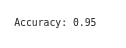
Though we got the prediction score of 95% (very great), it does not tell us which features push the breast cancer prediction towards benign or malignant. We need to explain what goes into the model leading to a specific predicted class. Other questions that may arise are:
- How do different features affect the prediction results?
- What are the top features that influence the prediction results?
- The model performance metrics look great, but should I trust the results?
Using SHAP Explainer to derive SHAP Values for the random forest ml model.
- Creating an object of a class TreeExplainer which takes our model as a parameter.
explainer = shap.TreeExplainer(model)
- Calculating the SHAP value
shap_values = explainer.shap_values(X_test)
- Displaying the expected value
print("Expected Value:", explainer.expected_value)
Expected Value: [0.66426696 0.33573304]
These lines of code above calculate the Shapely values.
- In our case, classification problem, the shap_values is a list of arrays and the length of the list is equal to the number of classes 2 (benign and malignant). This is true for the expected_values also. Besides, we should choose which label we are trying to explain and use the corresponding shap_value and expected_value in further plots. Depending on the prediction of an instance, we can choose the corresponding SHAP values and plot them as shown below.
NB: In case of a regression out of scope of this article, the shap_values will only return a single item.
row=0
for which_class in y.unique():
    display(shap.waterfall_plot(shap.Explanation(values=shap_values[int(which_class)][row], base_values=explainer.expected_value[int(which_class)], data=X_test.iloc[row],feature_names=X_test.columns.tolist())))
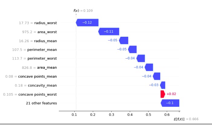
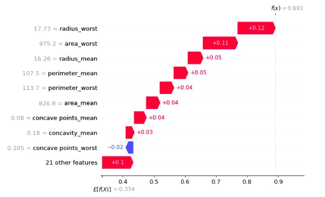
In the above plot, f(x) is the prediction after consedering all the features E[f(x)] is the mean prediction
- The blue bar shows how much a particular feature decreases the value of the prediction.
The red bar shows how much a particular feature increases the value of the prediction.
Plotting SHAP force plot for the first row of test data.
shap.initjs()
shap_values_first_row = explainer.shap_values(X_test.iloc[0])
shap.force_plot(explainer.expected_value[0], shap_values_first_row[0], X_test.iloc[0])
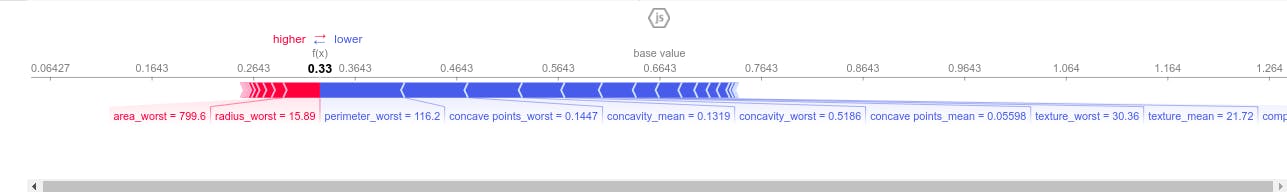
This force plot above depicts the weight of each feature contribution by the model centered around the baseline SHAP value of 0.6423 which either increase or decrease the prediction. The red color depicts features having positive weight on the model and the blue color depicts features which have negative weigh on our model. That is to say perimeter_worst ,concave points_mean,concave point_worst, concavity_worst,concavity_mean and textture_worst decrease the model prediction. Therefore the first test sample has a low risk of developping breast cancer (benign tumor).
- Shap summary_plot
shap.summary_plot(shap_values[0],X_test)
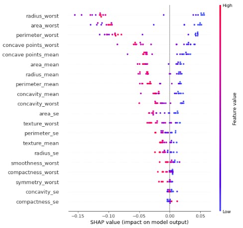
This force plot above depicts the weight of each feature contribution by the model centered around the baseline SHAP value of 0.6423 which either increase or decrease the prediction. The red color depicts features having positive weight on the model and the blue color depicts features which have negative weigh on our model. That is to say perimeter_worst ,concave points_mean,concave point_worst, concavity_worst,concavity_mean and textture_worst decrease the model prediction. Therefore the first test sample has a low risk of developping breast cancer.
shap.summary_plot(shap_values[1],X_test)
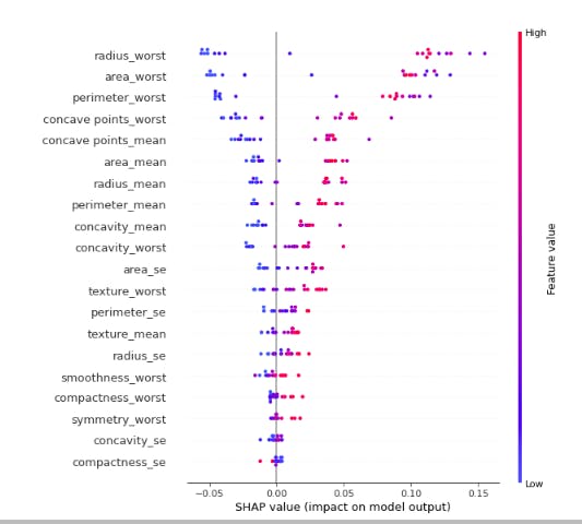
The red color depicts features having positive weight on the model and the blue color depicts features which have negative weigh on our model. That is to say perimeter_worst ,concave points_mean,concave point_worst, concavity_worst,concavity_mean and textture_worst increase the model prediction. Therefore the first test sample has a high risk of developing breast cancer (malignant tumor).
There are other shap plots we could explore but for lack of time, I would like to introduce you to an amazing python library which explains shap model just in 5 lines of code.
- Explainerdashboard
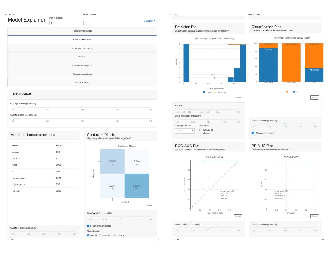
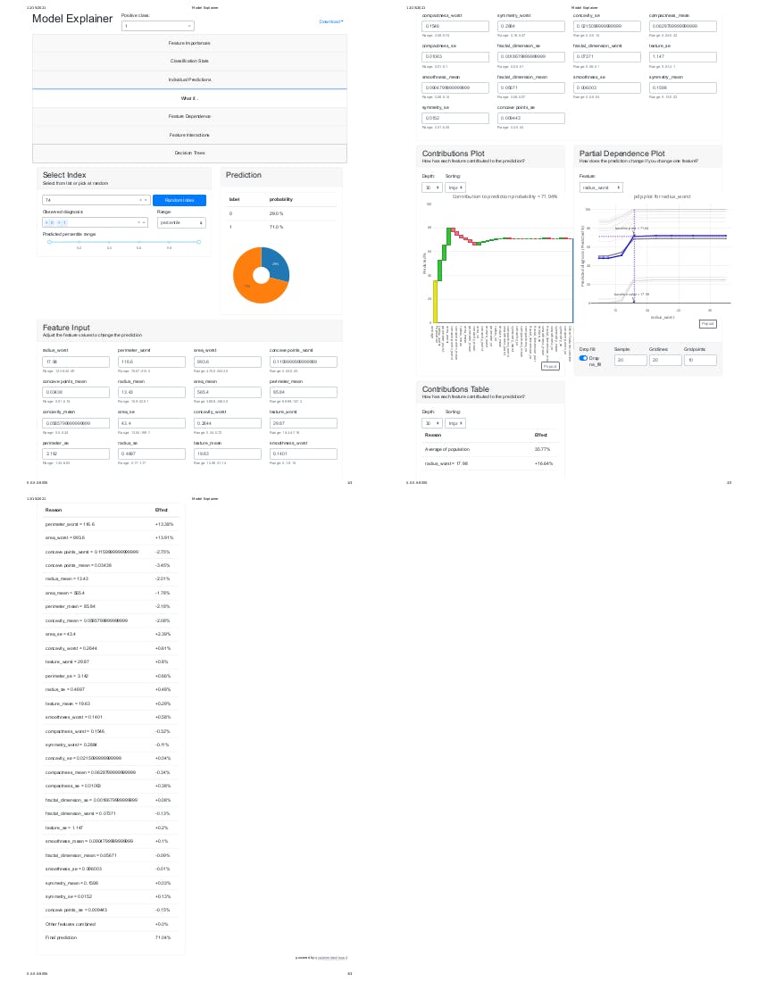
explainerdashboard is a library for quickly building interactive dashboards for analyzing and explaining the predictions and workings of (scikit-learn compatible) machine learning models, including xgboost, catboost and lightgbm. This makes your model transparant and explainable with just two lines of code. It allows you to investigate SHAP values, permutation importances, interaction effects, partial dependence plots, all kinds of performance plots, and even individual decision trees inside a random forest. Besides, explainerdashboard helps any data scientist to create an interactive explainable AI web app in minutes, without having to know anything about web development or deployment.
Let's get into the code now.
- Installing explainerdashboard It takes 4 minutes to get it done
!pip install explainerdashboard
- Importing the libraries
from explainerdashboard import ClassifierExplainer
from dash import html
- Creating an object of the class ClassifierExplainer and passing the model, X_test and y_test as arguements
explainer = ClassifierExplainer(model, X_test, y_test)
- launching the dashboard:
from explainerdashboard import ExplainerDashboard
ExplainerDashboard(explainer).run()
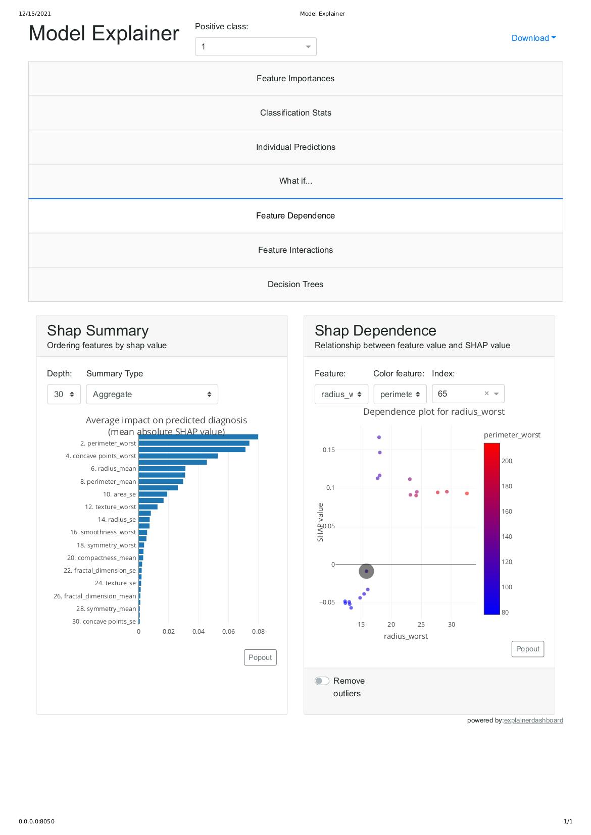
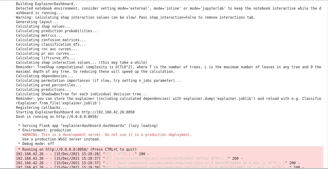 After executing the above, it should display the flask web server IP address as shown above in the image. please copy it and paste into your web browser.
http://0.0.0.0:8050/
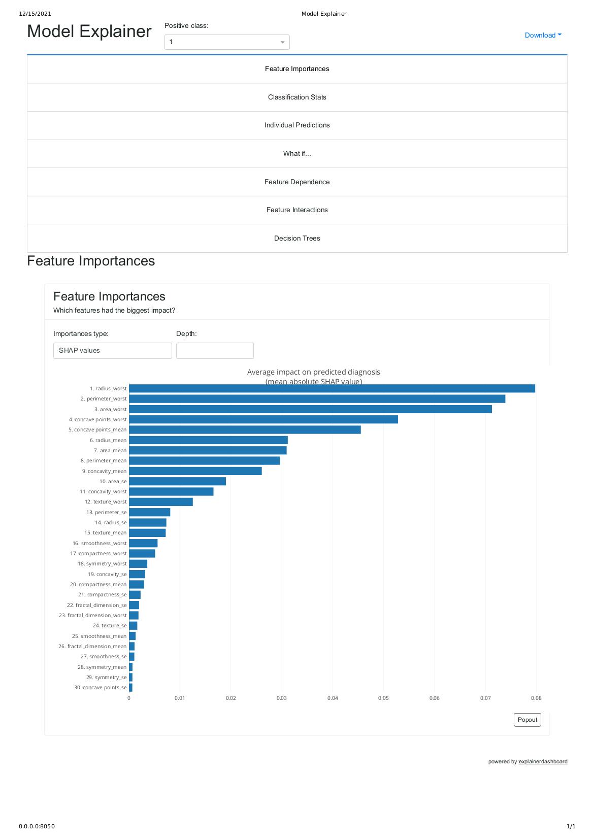
As shown above this summary_plot shows features that have the biggest impact on predicted malignant cancer based on shap values
Kudos for making to the end of this article.
Conclusion
We started by a classification problem using random forest on breast cancer dataset from hospital in the USA. After analysis on the dataset, we found out that 250 people have benign breast cancer and 148 have malignant breast cancer. Next, we fed our training set into the black box and evaluated the model performance on unseen data giving 95% accuracy score. Finally, we used SHAP to explain and interpret our black box model.
If you want to contribute or you find any errors in this article please do leave me a comment.
You can reach me out on any of the matrix decentralized servers. My element messenger ID is @maximilien:matrix.org
If you are one of the mastodon decentralized server, here is my ID @maximilien@qoto.org
If you are on linkedIn, you can reach me here
Warm regards,
Maximilien.